Last week, like many others recently, I received a notice from JetPack that I’m going to have to start paying for a commercial version of my little personal blog because it was getting a few more views than normal. (Turns out people are really excited about autumn being on the way and need song suggestions for it!) During my research into what exactly JetPack is and whether and how I can get rid of it (I did, and switched to Google Analytics), I decided the time was ripe for a whole redesign.
So I looked closely at some similar types of blogs to get an idea for what looks are popular these days, made notes on my favorite elements, and decided to finally sit and learn to use the Gutenberg editor! I know WordPress wants to phase out the classic editor, so really, it was well past time to teach myself some new tricks and bring myself up to date.
That’s how I found myself still awake at 5am last night/this morning learning about Gutenberg. (I’m a night owl, anyway, but 5 is late even for me. However, I also find it impossible to turn off my mind and walk away when I’m on a roll with a project and strange worker-bee energy is making me feel like I’m caffeinated, so trying to sleep would not have worked.)
I’m…mostly done. There are still some things I need to tweak here and there. I haven’t figured out, for example, how to adjust the font size of my site title to make it fit properly on a mobile screen. I’ve tried and I’ve tried, to no avail.
I would say, after last night, Gutenberg gives you a lot of options to really make your site your own. And in some ways it is easy enough. In other ways, like anything else, there is a stubborn learning curve. Now that I’ve done this, though, I could do it again, and faster next time.
Among the changes I made is a new photo menu on the main page that I’m pretty excited about. (It looks so much better on desktop than mobile, but so far I haven’t figured out how to turn it off on mobile, so for now, it stays.) It just looks so clean and neat, I feel.
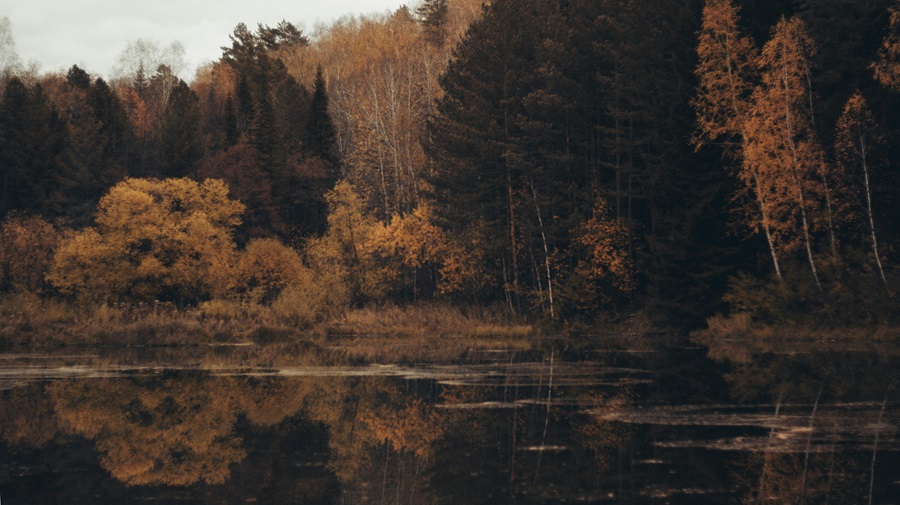
There’s a new cover image now (by photographer nizametdinova). Part of the reason I decided to finally go ahead with this project was because I could never figure out how to make my cover image work properly in my old theme and editor. And now I will never have to. I also updated my color scheme based on my recently-discovered Zyla colors. (That means the background is one of the colors of my skin, the font is one of the colors from my hair, the red that occasionally appears is one of the colors of my skin when I blush, etc.) While the idea seemed even to me, who came up with it because I happened to be looking at my palette while thinking about this, to be a little strange and maybe a bit creepy, I ultimately decided that I liked it. This is me communicating with you, after all. What better way to subtly reinforce that idea digitally? So I said goodbye to my old but similar background color that was inspired by my favorite car and embraced the new.
I have a little bit more work to do, but for now, I’m feeling happy and satisfied with what I accomplished this weekend.

Leave a Reply